Decorative Wall Art Pieces: Style Ideas for Any Room
Updated on: 2026-07-23
Decorative wall art pieces help define mood, add texture, and improve the overall balance of a room. Choosing the right scale, color palette, and mounting method prevents common errors such as overcrowding or misalignment. This guide explains practical selection criteria and layout techniques that work across bedrooms, living rooms, hallways, and offices. You will also find clear pros and cons for popular styles and materials, plus recommendations to make confident buying decisions.
What Decorative wall art pieces can do for your home
Decorative wall art pieces are not merely finishes. They are design tools that shape how a room feels from the first glance. When you select artwork with a deliberate purpose, you can create cohesion between furniture, lighting, and architectural details. Wall art also provides visual rhythm, especially in spaces that otherwise appear flat or overly neutral.
A strong piece can anchor a seating area, soften hard surfaces, and guide the eye toward key features such as a fireplace, a console, or a doorway. It can even support a functional goal. For example, in hallways, the right composition can make movement feel more intentional and less chaotic.
To get consistent results, consider the artwork as part of an ecosystem. Wall art interacts with wall color, floor tone, trim, window brightness, and the scale of nearby objects. This is why the best outcomes come from planning rather than reacting to a single purchase decision.
Common Challenges When Choosing decorative wall art pieces
Even well-intentioned shoppers often encounter the same problems. The good news is that these issues are predictable, which means they are also preventable with a practical checklist.
1) Scale that overwhelms or looks too small
Artwork that is too large can dominate the room and reduce balance. Artwork that is too small can appear disconnected from the furniture. A simple rule is to measure the available wall area and then compare it with the size of the surface you want it to support. If the art sits above a sofa, the width should typically relate to the sofa’s width rather than the height of the wall.
2) Color conflicts with existing finishes
Walls, upholstery, and flooring often contain subtle undertones. If your wall art introduces a competing undertone, the space can feel visually tense. Start by identifying one or two colors already present in the room, then choose artwork that echoes those tones. If you prefer contrast, use contrast intentionally through accent colors rather than attempting to match every shade.
3) Poor placement and alignment
Placement errors usually come from inconsistent centering. The goal is not only to hang the art on the wall, but also to align it with architectural elements and sightlines. A common approach is to center the artwork relative to the main feature below it. For galleries, keep consistent spacing and maintain alignment across multiple frames.
4) Limited durability or finish suitability
Some materials react to sunlight, humidity, or dust. If your wall art will be positioned near windows or in high-moisture areas, prioritize finishes intended for that environment. Also consider how you will clean it. A piece that is hard to maintain can lose its visual impact over time.
5) Choosing a style that is not actually compatible
Many people buy artwork based on style inspiration rather than daily lived experience. A formal, highly detailed look can feel out of place in a relaxed, casual home. Conversely, minimalist designs can feel cold in spaces that need warmth. Choose artwork that supports how you want the space to feel every day.

Balanced layout with measured spacing and centered alignment
Style and material comparison for decorative wall art pieces
Selecting artwork involves more than aesthetics. The material and style affect how the piece reads at different distances, how it responds to light, and how it integrates with your decor.
| Style or Material | Strengths | Limitations |
|---|---|---|
| Framed prints | Flexible color matching, easy to swap sizes, generally simple maintenance | Frame choice matters; low-quality glazing can reduce clarity |
| Canvas artwork | Texture can add depth, works well with layered decor | Can be harder to clean; color can shift under strong lighting |
| Metal wall art | Modern visual character, reflective surfaces can energize neutral rooms | May show glare; finish can require careful handling |
| Wood and carved relief | Warmth and dimensional interest, strong for rustic or transitional spaces | Heavier pieces may need sturdier mounting |
| Tapestry and fabric wall hangings | Softens acoustics and adds warmth, ideal for bedrooms | Not all pieces tolerate sunlight; cleaning must be gentle |
| Mixed-media compositions | Creates focal depth, supports complex color stories | Higher visual complexity can overwhelm small rooms |
When deciding, focus on a practical match: choose materials that align with your lighting conditions and your tolerance for maintenance. If you want an easy refresh, prints and canvas are often the most adaptable. If you want a strong sculptural statement, carved relief or metal pieces may fit better.
How to choose decorative wall art pieces that fit your space
Buying with intention saves money and time. Use the following framework to select decorative wall art pieces that integrate naturally with your room’s layout.
Define the role of the artwork
Before selecting styles, decide what role the artwork should play. Options include:
- Focal anchor: A single larger piece above a sofa, bed, or console.
- Supporting texture: Smaller art that complements existing color and pattern.
- Gallery narrative: Multiple pieces that tell a cohesive visual story.
- Light-and-color enhancer: Art that brightens shaded rooms or balances warm lighting.
Clear role definition reduces decision fatigue and prevents mismatched purchases.
Work from the color palette, not from isolated favorites
Start with the room’s dominant colors: wall tone, upholstery, and major flooring hues. Then choose artwork that either:
- Matches one of those dominant tones for calm harmony, or
- Introduces a controlled accent color that echoes smaller items (pillows, rugs, ceramics).
If your room is neutral, you can increase visual impact with a bolder art choice. If your room is already busy, select artwork with fewer competing elements.
Use scale planning for fast, reliable results
Scale planning is one of the highest-return actions you can take. Consider typical placement zones and the visual weight of the design.
- Above a sofa: Choose artwork with a width that relates to the sofa and keep vertical spacing consistent.
- Above a console: Use a centered composition; allow the piece to breathe from the decor below.
- In hallways: Use smaller works arranged in a consistent grid or a controlled stagger.
- In bedrooms: Coordinate artwork with bedding tones and maintain a calming visual density.
Plan the layout approach: single piece versus gallery wall
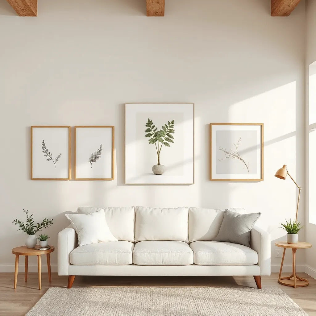
Single pieces create clarity and reduce the need for complex alignment. Gallery walls can be rewarding but require patience. If you choose a gallery wall, keep these guidelines in mind:
- Maintain consistent frame spacing across the arrangement.
- Choose a common theme, such as color family, subject category, or frame finish.
- Ensure the total grouping stays proportional to the wall area.
Consider mounting and wall compatibility
Mounting affects both safety and visual outcome. Heavier pieces should be anchored into appropriate wall structure. Lighter works may use removable systems, but always follow weight guidance. Also consider how the mounting creates shadows. Thin frames can cast minimal shadow, while deeper frames can add depth and separation from the wall.
Coordinate with lighting for better visual clarity
Lighting changes how artwork appears. Ambient light can flatten colors, while directional light can reveal texture and depth. If you use wall lights, consider positioning so that glare does not obscure the artwork’s surface. For a more consistent presentation, choose lighting temperatures that harmonize with the room’s palette.
If you are reworking your interior presentation beyond wall art, you may also evaluate complementary decor elements. For example, you can explore a lighting-focused selection at SellHots to understand how lighting choices influence perceived color and depth across surfaces.

Gallery wall grid with consistent spacing and balanced frames
Summary and recommendations
Decorative wall art pieces work best when selection is guided by function, scale, and compatibility with the existing room environment. Start by defining the role of the artwork, then align it with a clear palette and proportional placement. Avoid common errors such as choosing a piece that is too small for the furniture, selecting conflicting undertones, or ignoring maintenance needs.
For most homes, the simplest high-impact approach is to choose one strong focal piece with a controlled color story and then add smaller supporting art only if it enhances the visual balance. If you prefer variety, a curated gallery wall is effective when spacing and framing finishes remain consistent. Use lighting as a final step to ensure the artwork reads clearly without glare.
As you refine your choices, treat your wall as a design system rather than a single surface. When the art, wall tone, and lighting cooperate, the room becomes more cohesive, and the impact of your decor lasts longer.
Q and A about decorative wall art pieces
How do I choose the right size for decorative wall art pieces?
Measure the wall area and compare it with the width of the furniture or feature below. Aim for an artwork width that visually relates to the main object it supports. As a practical starting point, create a layout in your mind: the artwork should occupy enough space to feel intentional, but it should leave comfortable margins around it.
What colors work best if my room has neutral walls?
Neutral walls provide flexibility. You can introduce one bolder accent color echoed in small decor items, such as textiles or ceramics. Alternatively, choose artwork that repeats subtle undertones from furniture or flooring to create calm cohesion. If you want higher contrast, do it through limited accents rather than multiple unrelated colors.
Are gallery walls harder than single statement pieces?
Gallery walls require more alignment decisions, including spacing, framing consistency, and total proportional balance. However, they are not inherently difficult if you use a structured plan. Keep frames consistent in finish, use similar spacing, and ensure the overall grouping matches the wall’s scale. When in doubt, start with fewer pieces and expand only after the layout feels balanced.
How can I prevent artwork from looking disconnected from the room?
Pick artwork that shares at least one visual thread with the room: a color family, a texture approach, or a design style. Ensure placement is centered relative to the main feature below it. Also check lighting conditions, because glare or overly dim lighting can make artwork appear less integrated.
What mounting method is safest for heavier pieces?
Heavier works should be installed using an appropriate anchoring approach. Verify the wall type and use mounting hardware rated for the artwork weight. If you are not confident, consult a qualified installer to reduce risk and maintain a level, professional presentation.
Can I use decorative wall art pieces in small rooms?
Yes. In small rooms, prioritize proportion and visual simplicity. Choose either one medium-sized focal piece or a compact gallery with consistent spacing. Avoid designs with excessive visual clutter, and ensure the artwork color story supports the room’s intended mood.
About the Author
SellHots is a home style and product presentation expert team focused on practical interior design decisions, including wall decor planning, room cohesion, and layout best practices. Our work draws on common retail display principles and real-world customer needs to help people make confident choices. We aim to keep guidance clear, actionable, and aligned with daily living. Thank you for reading, and we wish you success in creating a space you enjoy.
Disclaimer: This article provides general guidance for choosing and styling wall decor. Always follow manufacturer instructions for installation and care, and use appropriate mounting methods based on your wall type and the artwork weight.
The content in this blog post is intended for general information purposes only. It should not be considered as professional, medical, or legal advice. For specific guidance related to your situation, please consult a qualified professional. The store does not assume responsibility for any decisions made based on this information.